
Color as Energy: How Emotion Moves Through Mandala and Dot Art
In dot and mandala art, structure often gets the attention first, symmetry, repetition, precision, pattern. But underneath all of that, there’s something quieter and more immediate at work: color. Color is not just decoration. It’s energy translated into visual form.

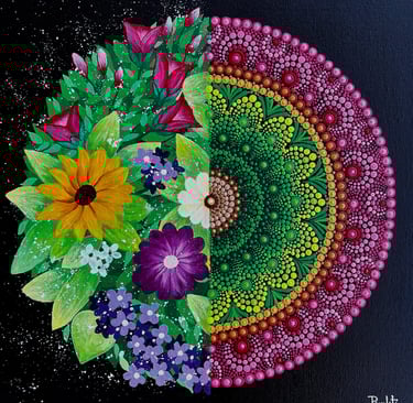
Color Changes the Feeling of a Pattern
The same mandala drawn in different colors can feel entirely different.
Soft blues and muted tones might create calm and stillness.
Warm reds and oranges can feel active, even intense.
Layered contrasts can introduce tension, movement, or depth.
The structure stays the same but the emotional language shifts completely.
Color doesn’t just fill space. It sets the tone of experience.
Emotion Embedded in Choice
Even when I’m not consciously assigning meaning to color, something intuitive happens in the process.
A choice is made without words:
this shade feels right here
this contrast needs balance
this layer needs softness
These decisions often reflect emotional states more than planned design.
In that way, color becomes a record of presence of what was felt in the moment of creation.
Layering as Emotional Depth
In dot work especially, color builds gradually.
One layer sits beneath another. Hints of earlier choices remain visible, even when partially covered.
This layering creates depth not just visually, but emotionally. It mirrors how experience itself works: nothing is fully removed, only transformed, partially revealed, partially hidden.
The final image becomes a kind of emotional landscape.
Color as Connection
Different people respond to color differently.
What feels calming to one person might feel energizing to another. What feels neutral to one might feel deeply personal to someone else.
This is where connection happens again between artwork and viewer, through interpretation rather than instruction.
Color becomes a shared experience, not a fixed meaning.
Beyond Meaning, Into Feeling
Not every color choice needs explanation.
Some things in art exist purely to be felt, not decoded.
A gradient that feels like movement.
A contrast that feels like pause.
A palette that feels like memory without a name.
These are not concepts, they are experiences.
If dots are structure, and space is balance, then color is breath.
It moves through the pattern, giving it emotional life. It shifts how we experience what is already there.
And just like everything else in mandala art, it doesn’t exist alone.
It connects:
to form
to space
to intention
to feeling
to the viewer
Another layer in the same unfolding system, quietly, constantly, interconnected.